For an identity we always search for the most characteristic details. For donorflex, that is the circle. The circle is a pivotal element that returns repetitively, also in the font, for example.
Donorflex is specialized in developing software solutions for English charitable organizations. Donorlfex provides a quick and comprehensive overview of data. Donorflex has won awards in the UK, for multiple, consecutive years.
The goal of donorflex was to increase the visibility of their company and product, and to extend their reach. Further, they wanted to have a freshened-up look of their corporate identity.
We created a new corporate identity, and logo. Fitting the new identity, we produced a website and created instructive videos, event teasers and a motion graphic.

For an identity we always search for the most characteristic details. For donorflex, that is the circle. The circle is a pivotal element that returns repetitively, also in the font, for example.
Colors have a prominent influence, because they can trigger a particular association. For donorflex, we chose blue and orange. Orange represents easy accessible, low threshold while blue stands for credibility.

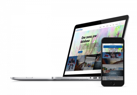
For the website of donorflex, we used a lot of photos and videos. For example in the menu buttons and to support the texts.
The instructive- and teaser videos were produced “remotely”. Donorlfex had purchased equipment under our guidance, and helped them getting started so they could shoot the takes themselves, Do It Yourself style. Then, we edited the materials, based on scripts that we received.

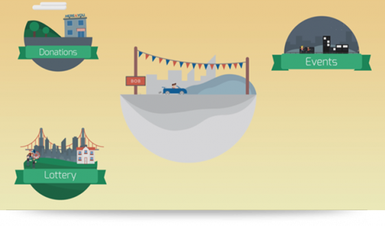
The motion graphic shows that donorflex is indispensable for English charitable organizations. It is fully based on the new corporate identity of donorflex, which shows the use of color and the circle, that returns as a common element.